Typography Herodotus
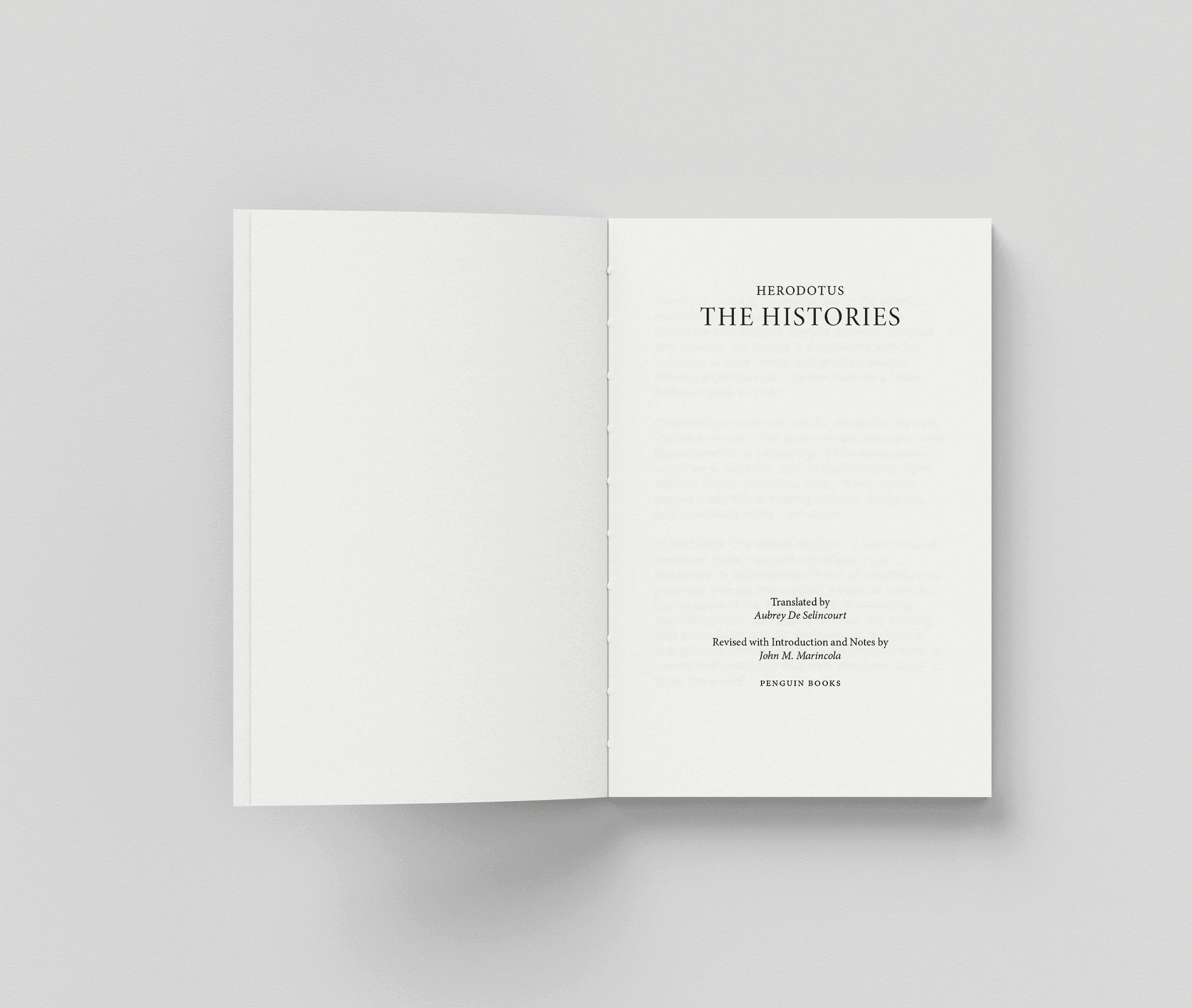
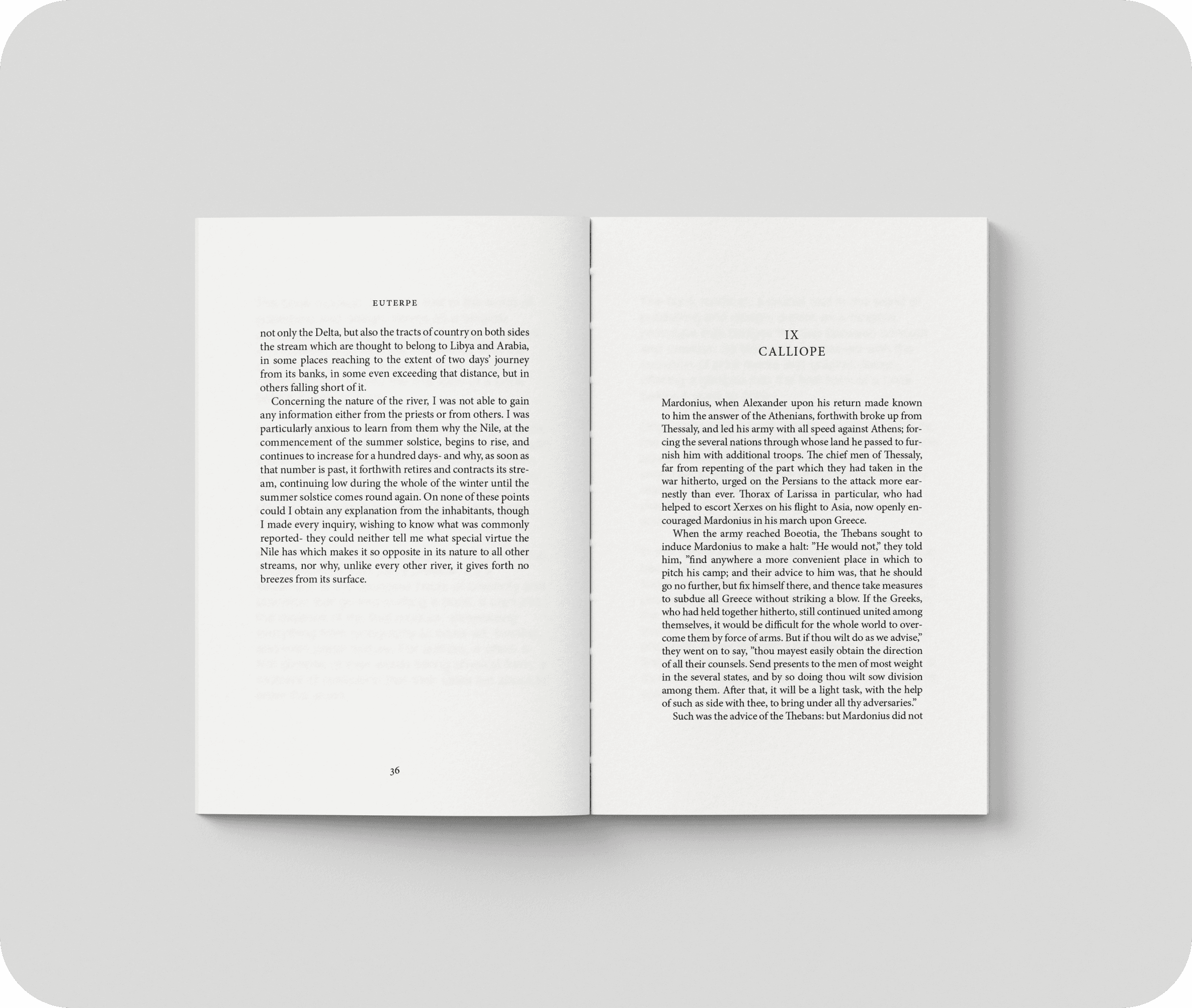
This project explores the art of typography through the redesign of a book's visual identity. The focus was on creating a balanced and engaging layout that enhances readability while expressing the book's essence through typographic choices. Careful attention was given to text alignment, spacing, and hierarchy to create a coherent reading flow.
To complement the typographic design, I created an abstract illustration for the cover, adding a unique visual dimension that reflects the book’s tone and character. The result is a harmonious blend of typography showcasing how type can shape a reader's experience.


